

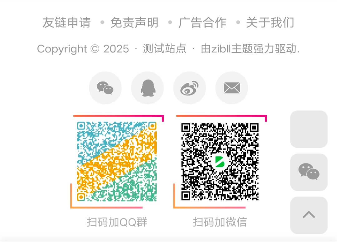
介绍
此效果是初一写出来的 因为初一写的是scss的 我改成了css代码 发出来记录下
效果图
教程开始
复制下面代码 添加到子比主题设置-全局-自定义代码-自定义css代码中即可
/*底部板块三图片border*/
.footer-miniimg p {
  position: relative;
}

.footer-miniimg p:hover {
  filter: contrast(1.1);
}

.footer-miniimg p:active {
  filter: contrast(0.9);
}

.footer-miniimg p::before,
.footer-miniimg p::after {
  content: "";
  border: 2px solid;
  border-image: linear-gradient(45deg, gold, deeppink) 1;
  position: absolute;
  top: -5px;
  left: -5px;
  right: -5px;
  bottom: -5px;
  animation: clippath 3s infinite;
}

.footer-miniimg p::before {
  animation: clippath 3s infinite -1.5s linear;
}

@keyframes clippath {
  0%,
  100% {
    clip-path: inset(0 0 96% 0);
    filter: hue-rotate(0deg);
  }
  25% {
    clip-path: inset(0 96% 0 0);
  }
  50% {
    clip-path: inset(96% 0 0 0);
    filter: hue-rotate(360deg);
  }
  75% {
    clip-path: inset(0 0 0 96%);
  }
}
© 版权声明
THE END


暂无评论内容